WellBites: Brand Endorsement Proposal for Almo Nature
Package and branding design for Almo Nature as a strategy for reaching larger audiences in the Finnish market.
Context
Group Project for Strategic Identity & Design Course at Aalto University
Duration
7 weeks (Jan. 8th - Feb. 16th, 2024)
Team
Unna Luoma, Kirsikka Poikkimäki, Alex Fagerström, Anna Ļedovska, Lucía Mantilla
Breif
Select a well-known food brand in Finland and design four to five new flavors and corresponding packages. The design should be an extension of the brand’s personality and reach larger audiences in the market.
Brand Selection
We chose Almo Nature because we thought their mission for pet wellness and sustainability ought to reach larger audiences.
Approach
A Combination of Primary and Secondary Research
Our course was heavily focused on secondary research such, as competitive and trend analysis. However, our team also collected empirical research from dog owners and vets because we wanted to build empathy with our potential users.
Work Division


Current State
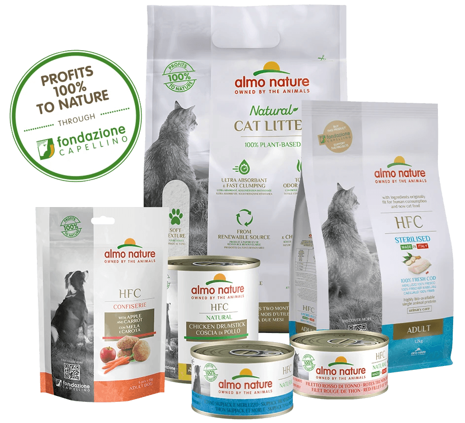
Almo Nature is a peripheral brand in comparison to its competitors in Finland.
We synthesized our data on market share, revenue, interviews with dog owners, and other desktop research into a C-D map. note: This diagram is not completely accurate, as we had trouble finding specific data for Finland.
Out of four dog owners we interviewed, three of them did not know about Almo Nature and one said they might have heard the name before.
Why is this?
Challenge
Outdated Visuals
The visuals may not appeal to modern audiences who prefer minimal aesthetics.
Unmemorable
The package does not stand out from competitors, whose designs are more eye-catching.
Unclear Brand Message
Almo’s values of promoting pet health and protecting nature as a non-profit are not well communicated.

Goal
Become an aspirational brand in the Finnish pet food market
by better communicating Almo Nature’s unconventional sustainability and pet wellness efforts in a way that attracts modern audiences.
Trends: Key Insights
Eco and Vibrant
We researched WGSN trends from fashion, product design, and interior design. Wellness and sustainability were repetitively mentioned across articles, as well as pet health and restorative wellness. Visually, vibrant and playful colors and shapes are anticipated in the upcoming years. Overall, it seems like customers want to be responsible while having fun at the same time.

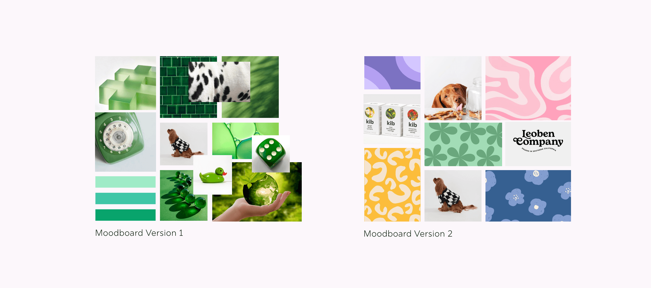
Mood Board
We combined our key insights from trend research with medical design.
We considered materials, colors, structures, shapes, moods, and characters in our mood board as a guideline for the team. We had several iterations of the mood board through feedback sessions with our lecturers and dog owners.


Process
Many many many interations
We went through the process of diverging and converging ideas many times until we found a perfect balance between packaging, typography, and surface patterning. We tested our prototypes with dog owners and other students along the way by explaining to us what they expect to buy from the packaging, and if they could intuitively open the lid.

Final Prototypes and Outcome
Brand Endorsement
A brand refresh in the form of healthy dog snacks in five flavors that each target specific health needs
Medical, yet Fun Look
Visuals are eye-catching, trendy, and approachable
Clear Brand Message
There is a stronger emphasis on promoting pet wellness and protecting nature
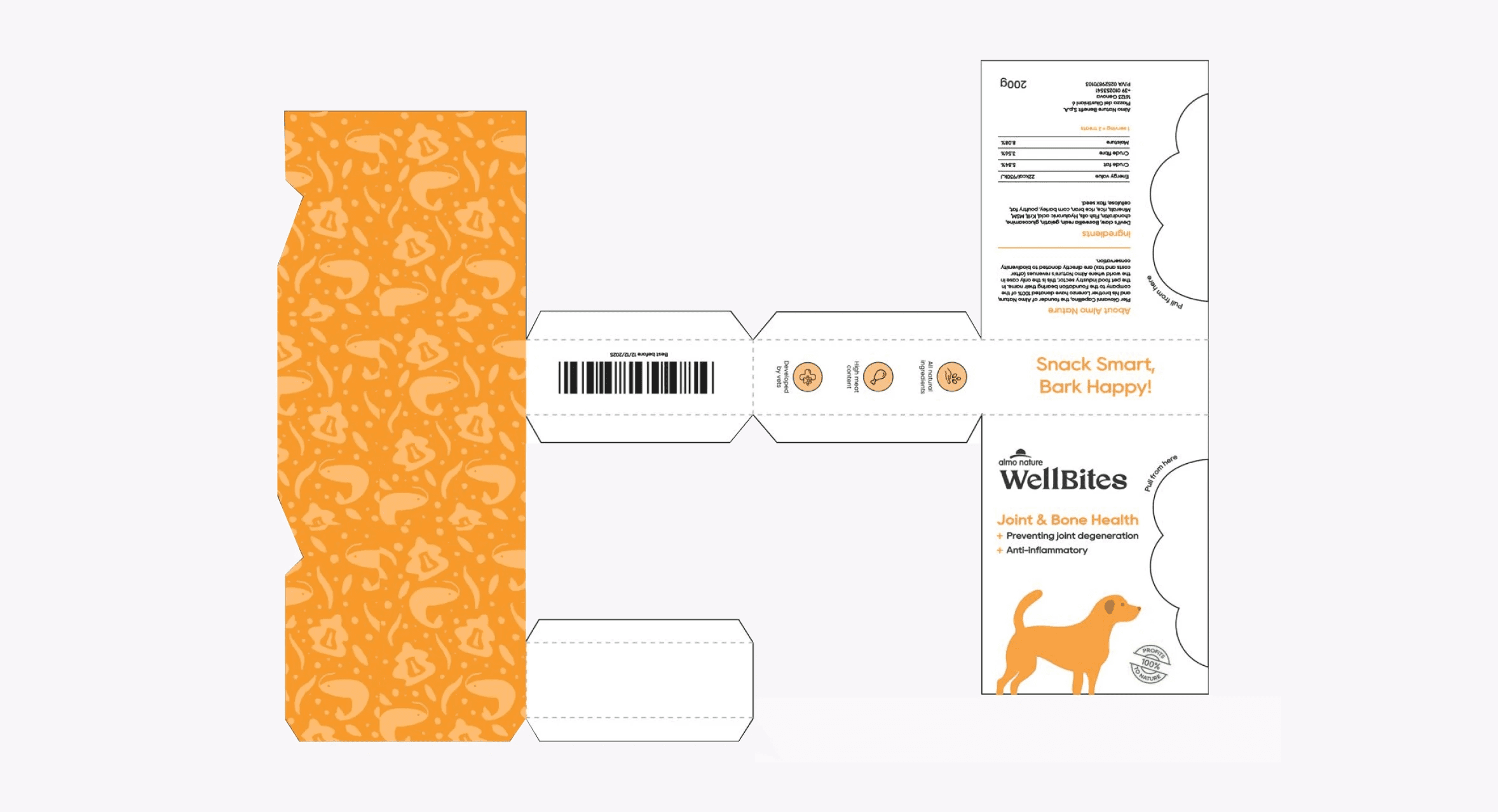
Information is bite-sized by using all faces of the box
During the designing process, we realized that we needed to keep a lot of information on the package. Unlike in the old package that had three sides, we used all six sides of the box to communicate information.
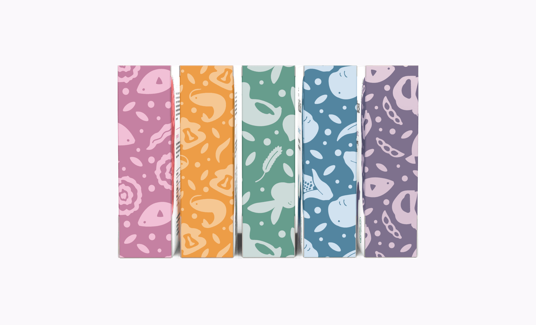
Five flavors for five common dog health issues
We consulted with a vet to ask about the most common dog health issues and foods that can help with the condition. Our flavors are, from the left: skin and fur health, joint and bone health, low fat low sugar, dental health, and hypoallergenic.

Five flavors for five common dog health issues
We consulted with a vet to ask about the most common dog health issues and foods that can help with the condition. Our flavors are, from the left: skin and fur health, joint and bone health, low fat low sugar, dental health, and hypoallergenic.
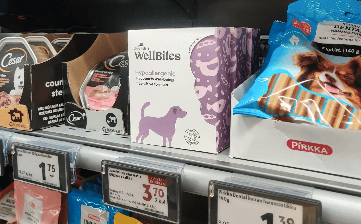
Impact
Our product stands out on the shelf.
We placed our designs in multiple K-markets, and many of our classmates and teachers from the course agreed that our product stands out compared to other products. However, we would need to test in a real-life context to know the true extent of how eye-catching our design is.
Improvements to be made
Sturdier material
In the course, we were allowed to use paper. It could have been interesting and more practical to experiment with other materials that would allow better storage of the treats.
Variation in shapes
The only way to distinguish between the flavors is through color, text, and patterns. Creating variations in the dog illustrations could make it easier to spot the flavor the user is looking for.
Almo Nature…??
There still remains the question if Almo Nature would actually use this design. Although it is a brand endorsement, the look is very different from their original branding.
Central Learnings
1
Package design has many dimensions.
Evaluating the package in four dimensions from the logo/symbol (1D), colors and materials (2d), structure and feel (3D), and user experience (4D), translated to a well thought out design with attention to detail.
2
User-centricity is part of strategy.
Even in package design, user-centered design methods helped us create a product that is desirable for dog owners. Expert opinions were aided when the user did not know what was best for their dog.
3
Communication within the team is key.
Once we split into different tracks (package, typography, and surface design), communication between each track became super important when putting our ideas together.